Articulating Your Product Design Principles

Product management is fundamentally a leadership role in that you are ultimately responsible for leading a product development team to deliver a compelling product that resonates with your customers. The vast majority of what I've personally learned about leadership comes from Jeff Weiner, who I watched lead LinkedIn as CEO over the 4 years I spent there. He singlehandedly transformed leadership in my mind from an amorphous set of soft skills to a specific set of tactics that you could execute to successfully lead an organization.
One of the most important lessons I took away from Jeff was the need to define your company's core, all the way from your vision to your values. It’s not enough to have an ambitious vision because unless that vision translates into how you manage your company on a day-to-day basis, that vision will never be realized. I saw Jeff operationalize this advice on a daily basis, whether it was repeating the mission, vision, and operating priorities every bi-weekly all hands, speaking to specific values in weekly leadership meeting discussions, and more.
I've found one of the best ways for product teams to make this advice actionable is by articulating your products design principles. Great product managers start by defining an ambitious vision of how the world will be a better place if they succeed. They then go on to develop a strategy by which their product will ultimately dominate the market. But then the team's real work begins: designing the actual product, validating your assumptions, executing to deliver the product, and rinsing and repeating to continue to validate and iterate on the offering. Too often the design/execution phases lose sight of the vision and strategy that was so painstakingly put together in the first place and they thus often lose their value. By translating your vision and strategy into a set of specific product design principles and then leveraging them throughout the design/execution phases, you can avoid this fate.
So what are product design principles? They are a collection of fundamental beliefs that serve as guideposts for making product design decisions. While there are generally accepted design principles that every UX professional should study, what we are interested in this case is not simply restating those general design principles, but instead crafting a set of product design principles that are unique to your own product. They should be tailored to helping you achieve your ultimate vision, they should convert your strategy into a set of specific tactics, and they should be actionable enough to help you weigh product trade-offs on a daily basis.
This is all very theoretical, so I thought the best way to make this real was through a detailed case study of my own product, Notejoy's, product design principles, the rationale behind them, and how we use them to guide product decisions. We ultimately came up with 5 product design principles in the form of easily repeatable catchphrases that we could invoke during roadmapping, design reviews, strategy discussions, and more. Let's go through each of these:
Productivity, meet collaboration
With Notejoy, we set out to solve one of the fundamental problems we observed in almost all organizations: that such a small portion of institutional knowledge today makes it to a searchable repository like a shared document or wiki. The vast majority of institutional knowledge remains trapped in people's heads, in personal notes, and in communication tools like email & Slack. When we started to investigate why this was the case our insight was that professionals often used low-friction, highly productive tools like notes, email, and Slack to get work done and communicate with each other and only begrudgingly moved to shared docs and wikis when they felt the project had scaled to a point that they had to. They were making a trade-off at the time to optimize for productivity as long as they could and then transition to tools that were more efficient at collaboration when that became the priority. We felt that this fundamental trade-off between productivity and collaboration didn't have to be the case. And that we could instead design a tool that was as productive as the tools that professionals used initially but then equally collaborative as the tools they felt forced to transition to. We came up with the idea of collaborative notes as the instantiation of a highly productive and equally collaborative tool.
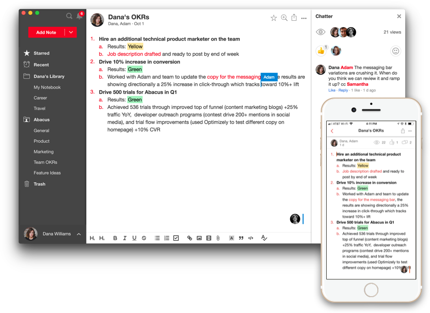
This notion of bringing productivity and collaboration together has always been a rallying cry for our product roadmap. It's why we've focused on making highly productive apps for Mac, Windows, iOS, and Android in addition to our web app. It's why we've invested so heavily on app performance for creating notes, searching, and more. And then on the collaboration side, it's why we've brought the best of collaboration: real-time editing, threaded comments, @mentions, smart notifications, and more directly into Notejoy.

Every quarter when deciding on roadmap, we assess how we are doing in terms of productivity and collaboration and ensure we are making the right investments to bring both pillars forward, ideally with functionality and experiences that address both.
Intuitive and powerful
I've never resonated with the idea of simple products being the end-goal because customers demand for you to continue to evolve to meet their growing needs or else your competitors will. That being said, bloated and complex software is certainly an even worse outcome. I think the right mentality to have is to strive for products that are both intuitive and powerful. Intuitive software means that someone can quickly come in and understand how to use your product without any directions. It means they don't have to hunt for functionality because it's fairly obvious. And it means your product results in minimal cognitive load as they use it. At the same time, you want to ensure your users can accomplish what they ultimately want to accomplish, which is where the powerful part comes in. iPhones are probably the greatest example of an intuitive and powerful product. The fact that our grandparents can even use iPhones speaks to how intuitive they made the smart phone compared to previous iterations. Yet the device is incredibly powerful. They enabled that power through a variety of mechanisms: gestures like swipes and button holds to hide more complex functionality. As well as an easy-to-browse app store that provides limitless possibilities but keeps the core experience streamlined. And so much more.
When doing design reviews for new functionality that we are incorporating into Notejoy, we constantly ask ourselves whether the new functionality we are introducing is intuitive and more importantly, does the core mainline user experience remain intuitive. This often requires a ton of iteration to figure out the right entry points for experiences, to determine how to simplify the experience, to brainstorm the right defaults. Sometimes it even means we ultimately don't introduce the functionality because we haven't yet been able to figure out a way to make it intuitive.
A great example of intuitive and powerful functionality that we recently introduced into Notejoy is the ability to search inside images and documents. Now you can search for text that exists in any images you upload to Notejoy simply by putting those search terms inside our search box. We do all the hard work of using machine learning and OCR to extract all the text we can find inside your images and attached documents, add it to our search index, modify our ranking to properly incorporate indexed text, and allow you to just include those keywords in your search. There is a ton of work on the back-end to support a variety of image and document formats, including PDFs, attached Microsoft Word files, and embedded Google Docs. But all of that is hidden from the user. Thus creating an intuitive and powerful experience.

Unlock collective wisdom
We have a dream for what the experience of joining an organization in the future looks like. You start your job and on day one, right after getting your badge, you immediately get to tap into all the collective wisdom of the entire organization. It contains all the secret's to the company's success, the way things get done within the organization, all the trials and tribulations the company has had with previous projects, and a wealth of learning on almost every skill required to be successful in the organization. Today the best organizations, like Apple with their Apple University, and Facebook with their Bootcamp, provide up-front training to help you learn the organization's culture and how to get things done. This learning is fairly limited today and the reality is the on-the-job learning from distilled resources remains minimal. But in the future, this looks more like Neo tapping into the Matrix and learning everything he needs to know in minutes.
The way to get to this dream state is we need to encourage, cajole, and elicit the sharing and discovery of collective wisdom in any way possible. We spend a lot of time thinking about this notion of collective wisdom. How can we capture it? How can we make it discoverable? How can we encourage people to share it? Ultimately, how can we unlock more of it?
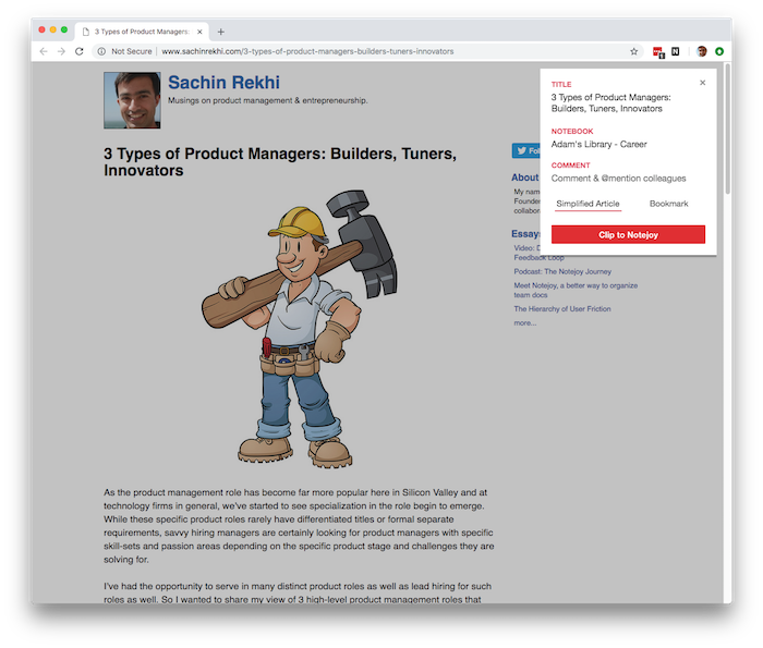
A great example of us putting the design principle of collective wisdom into practice was in the recent creation of our social web clipper. Tons of users have been asking for a web clipper to mimic the functionality of Evernote. But we decided to make it a tool for capturing collective wisdom from day one by allowing you to clip content into a shared team library, @mention colleagues, and comment on the content. There are a ton of ways teams could use this. One simple example is industry news. We all have those emails or Slack messages that we send out with a link to an article about a new competitor in the space or other interesting news. We send it out to a few colleagues, get some reactions, and then move on with our lives. But that represents a lost moment to memorialize that content for others who join and are interested in understanding the competitive landscape or the team's thoughts on various industry events. With Notejoy's social web clipper, you can now share the article with colleagues, have that same initial conversation with them, but now that becomes a searchable archive available to anyone in the future and ultimately a way to capture the team's collective wisdom.

Professionals are humans too
The biggest fallacy I learned in my B-School economics class is to think of humans as rational actors. They are in-fact far from it. And I think designers of consumer products often acknowledge this. But I've found when people are designing products for businesses they are often only optimizing for efficiency, productivity, ROI, and other business goals.
I think this is a mistake and we constantly try to remind ourselves that professionals are humans too. I vividly remember doing a user interview when I was at LinkedIn with a user who we asked to walk us through what he normally does when he comes to LinkedIn, what he clicks on, and why. He started by walking us through browsing the homepage and looking for any interesting news items, and then mentioned that he normally goes to his LinkedIn profile. We drilled into why he went to his profile as he didn't have anything specific to update. And after a few initial excuses and an uncomfortably long pause, he admitted that if he's being honest, looking at his LinkedIn profile to him was like checking himself out in the mirror. Browsing it just made him feel good about his professional accomplishments. That truth was such a strong reminder that professionals are human too and that we need to constantly build products that elicit emotions, that create confidence, and that spark joy.
We've designed a variety of experiences in Notejoy with this realization. Note views to make you feel good that your contributions aren't going unnoticed. Light-weight reactions to give you additional feedback on people appreciating you for contributing or sharing knowledge. Author profiles that help you automatically put your best work in front of coworkers. These features are not in the name of efficiency and productivity. But instead in service to the acknowledgement that professionals are humans too.

It’s a best-of-breed world
One of the trends that has been enabled by SaaS is the ability for team's to find best-of-breed tools that are 100% focused on a specific vertical or use-case and easily adopt them. This is in stark contrast to the previous era of simply buying large vendor suites that covered a lot of your needed functionality because it reduced implementation cost and worked well together. SaaS now makes it easy to implement best-of-breed solutions and the current focus on deep integrations between SaaS solutions via API integrations is solving for making them work well together as well.
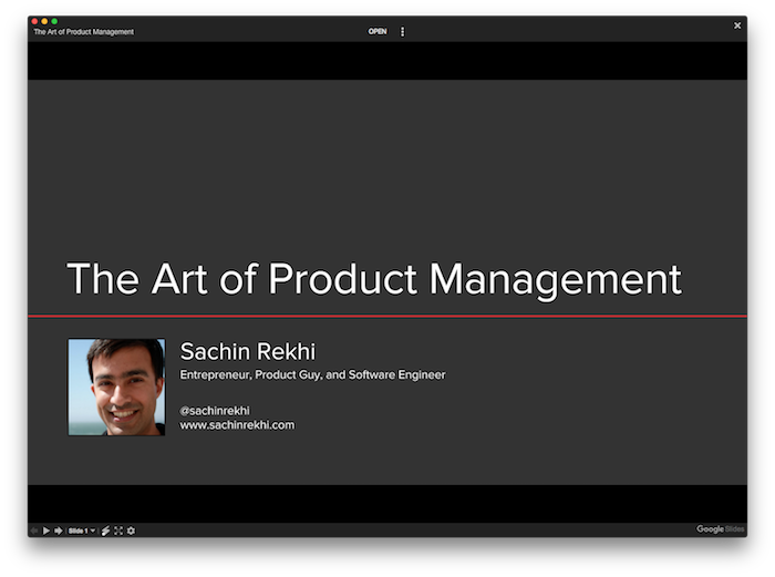
We are strong believers that best-of-breed software is the very future of all software and we embrace that in two ways. First, we try to design Notejoy to be a best-of-breed tool in the collaborative notes space it occupies. We rarely launch MVPs but instead invest in depth of functionality around each of our core pillars within our market. At the same time, we try to integrate deeply with all the other tools that are part of your existing workflow and don't assume you will move all your activity to Notejoy. That's why we've invested in deep integrations with Google Drive, Microsoft Office, Slack, Trello, and many more coming. For example, we have no interest in building presentation software, so instead allow you to attach Microsoft Powerpoint files and Google Slides directly into Notejoy with a rich viewer. We have teams that share all their All Hands slides in Notejoy because they find it a far better way to make their presentations discoverable within their organization while still using their favorite presentation software, fully embracing the best-of-breed mantra.

We constantly ask ourselves, what does best-of-breed look like in this case? If it fits in our core, we look to build it ourselves. But if we don't think we can be best-of-breed at it, we are happy to integrate deeply with other great solutions in the space.
I hope this Notejoy case study shows you the benefits of leading products with articulated product design principles. And maybe even convinces you to articulate them for your own product.
Want to accelerate your product career?
I've finally distilled my 15+ years of product experience into a course designed to help PMs master their craft. Join me for the next cohort of Mastering Product Management.
Are you building a new product?
Learn how to leverage the Deliberate Startup methodology, a modern approach to finding product/market fit. Join me for the next cohort of Finding Product/Market Fit.
Enjoyed this essay?
Get my monthly essays on product management & entrepreneurship delivered to your inbox.
Jan 09, 2019

